E-commerce
Zero to Launch: Designing a Delivery App Experience
Crafted a smooth delivery journey from scratch—owning everything from UX to final UI, and establishing a reusable design system.
Overview
Nana Delivery is a grocery delivery service focused on providing quick, affordable access to essential products. Designed to make convenient shopping accessible to everyone, it combines efficiency and affordability to meet everyday needs.
Challenge
Design a grocery delivery app from the ground up for users in need of affordable, fast services. The app had to be simple, accessible, and cater to a broad audience compared to existing delivery apps that are often expensive or less accessible. The project required rapid ideation and iteration, alongside the creation of a new design system to ensure scalability and consistency.
Results
The app was live just two months after the project began, thanks to rapid design iteration and collaboration. This quick delivery contributed to the app's fast adoption, helping Nana raise $3.6 million in three months and expand its operations significantly. The user-friendly, scalable design was key to supporting this growth, ensuring the app remained both accessible and efficient as it scaled.
20.97%
Monthly growth in downloads
19,360
Downloads in the first three months
Empathize & Define
From day one, we knew exactly who we were designing for: a broader audience often left out of the convenience economy. The goal was to serve Brazil's C and D classes, people who typically didn't have access to fast delivery apps due to high prices or limited regional coverage.
Inspired by the team's past experience at Zé Delivery, we already had valuable insights about user behavior, logistics, and market gaps. This allowed us to skip lengthy research phases and jump straight into rapid ideation. With affordability, speed, and accessibility as core pillars, we began crafting an experience tailored for everyday needs.
Problem statement
How might we bring fast, affordable grocery delivery to users who are typically underserved by traditional apps—ensuring the experience is simple, accessible, and ready to launch within a short timeframe?
Ideate
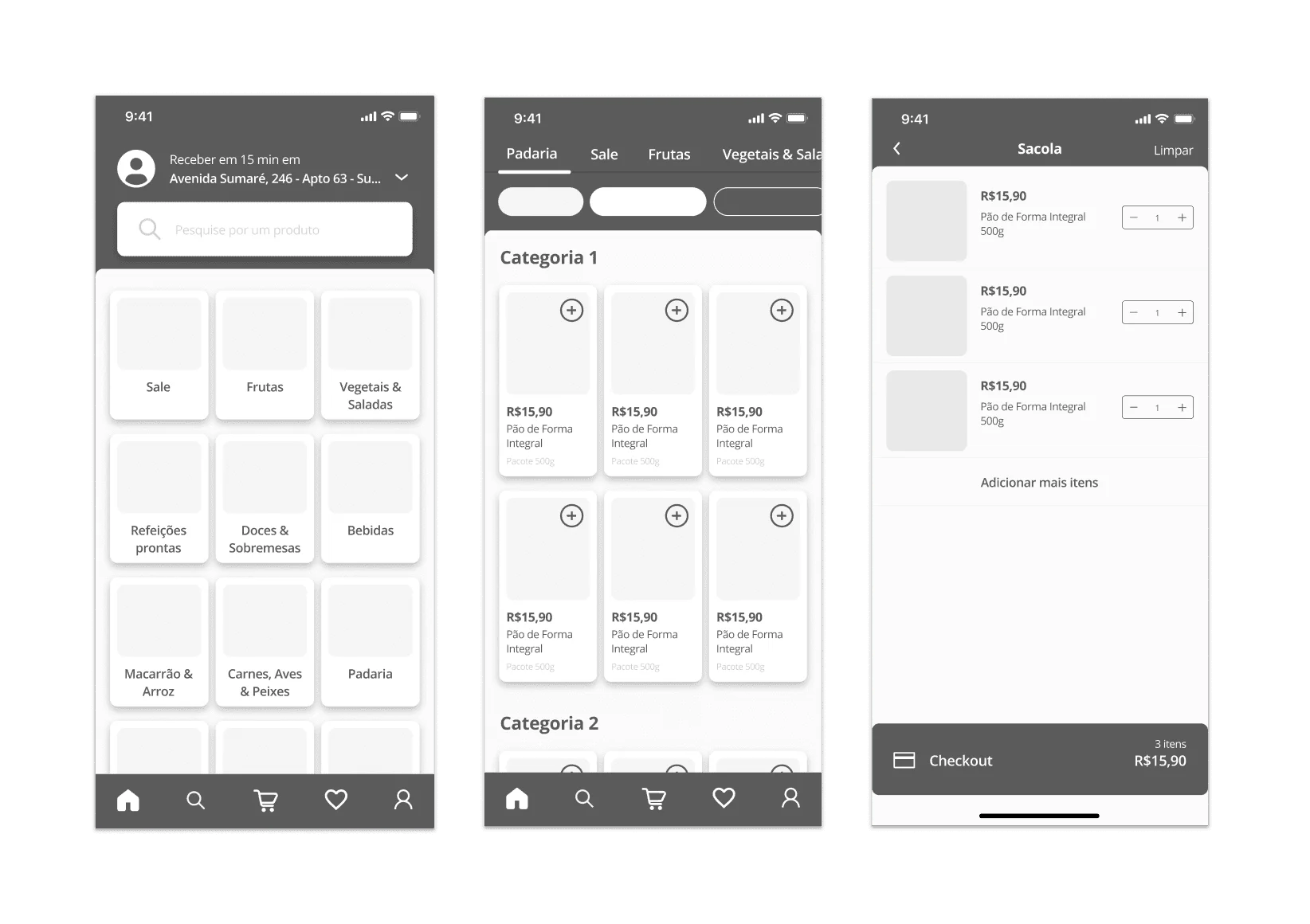
With the core user needs and business direction already well-defined, I was able to jump straight into sketching and wireframing the main flows from scratch. Leveraging insights from previous experiences and similar apps, I focused on crafting a simple, intuitive structure that prioritized speed and ease of use, especially for users less familiar with online shopping. The goal was to set a solid foundation we could later test and iterate on quickly.
Build
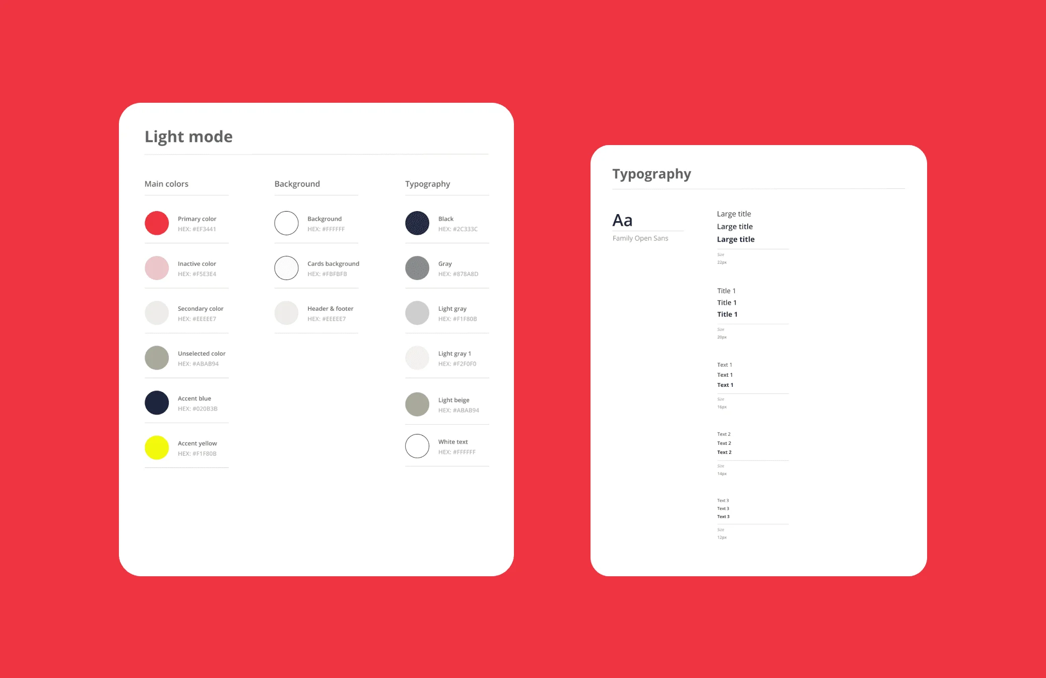
After establishing the initial wireframes, we moved quickly into designing high-fidelity screens to bring the app to life. Simultaneously, we began developing a comprehensive design system that would ensure consistency and scalability as the app grew. By building the design system alongside the screen designs, we ensured that the visual and functional elements of the app remained unified from the outset.
The design system included guidelines for color usage, typography, iconography, and UI components like buttons, inputs, and cards, everything necessary to maintain a cohesive experience as we iterated. This approach not only streamlined our workflow but also set the foundation for future growth, allowing us to scale the app quickly without compromising on quality or user experience.
The solution
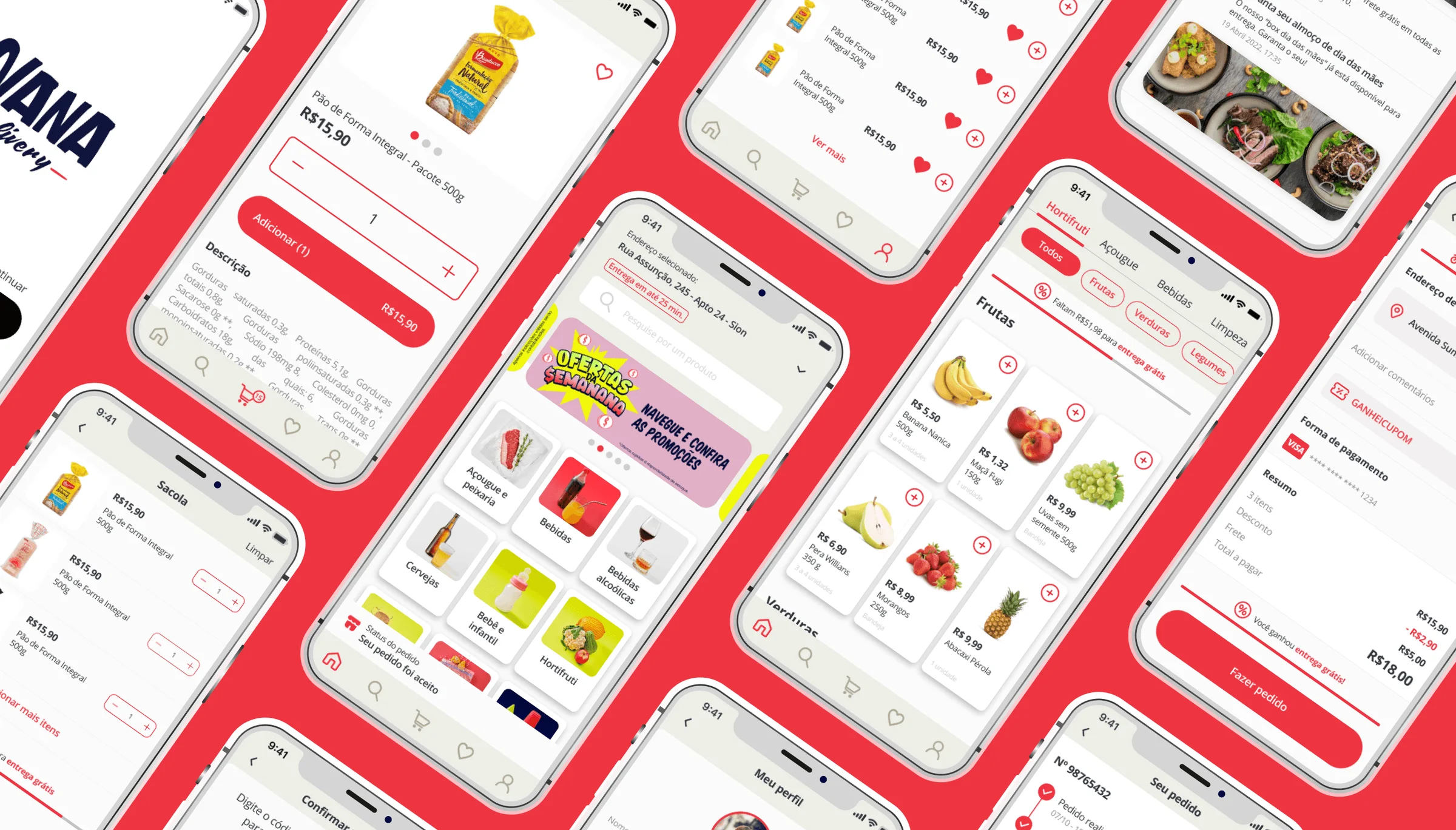
We designed a mobile application that makes affordable, ultra-fast grocery delivery accessible to underserved communities. The app was built to serve users from lower-income backgrounds (classes C and D), with a streamlined shopping flow that simplifies everything from product browsing to checkout.
With a clean layout, straightforward navigation, and bold, easy-to-read visuals, the experience was tailored for users with varying levels of tech familiarity. Clear categories, familiar product visuals, and minimal friction ensured that even first-time users could place an order within minutes.
The goal was to bring real convenience to those who usually have to choose between price and practicality, empowering them with a reliable, fast, and intuitive shopping experience right from their phone.
Shopping experience
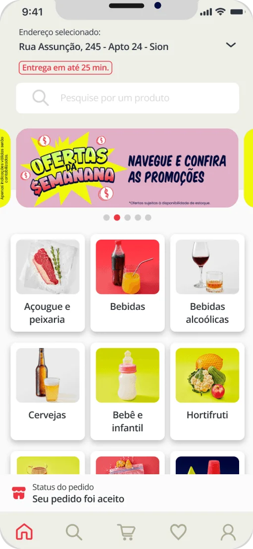
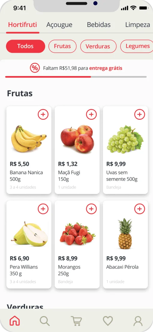
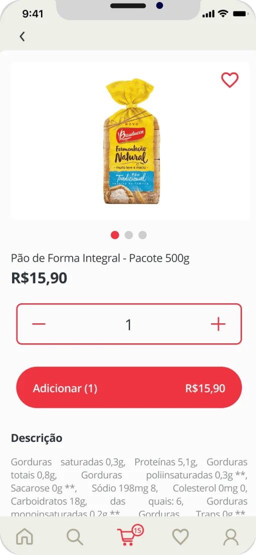
We crafted a fast and intuitive shopping flow focused on speed, clarity, and ease of use—helping users find and add products quickly. The home screen offers quick access to categories, promotions, and popular items, while the category and product pages are structured to simplify browsing and comparison. Large tap targets, clean layouts, and straightforward interactions make it easy to fill the cart in minutes.
This flow was designed to minimize friction and optimize decision-making, so users can complete their order even on a busy day.
Checkout flow
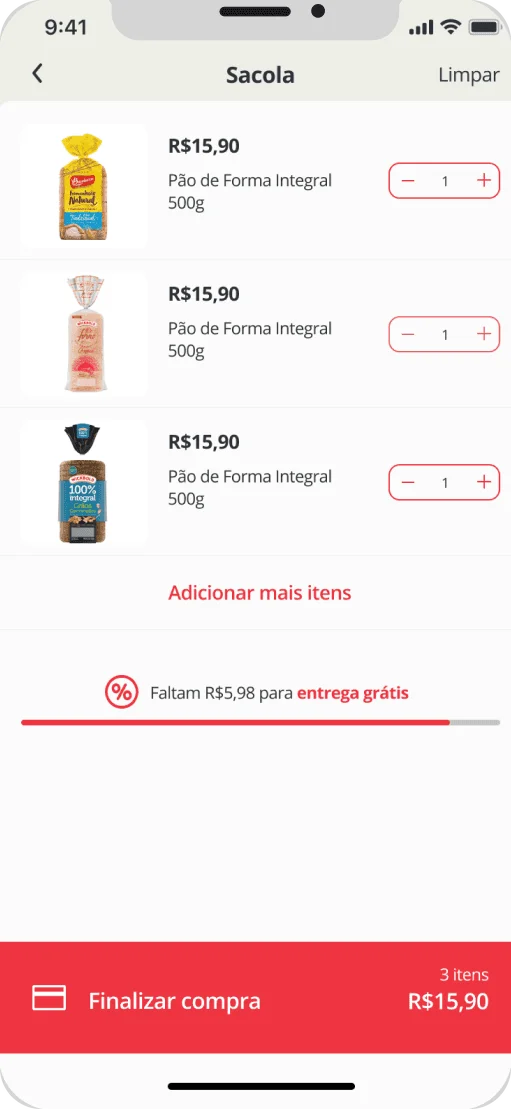
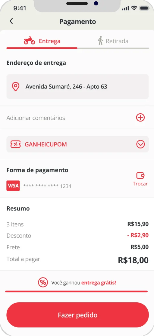
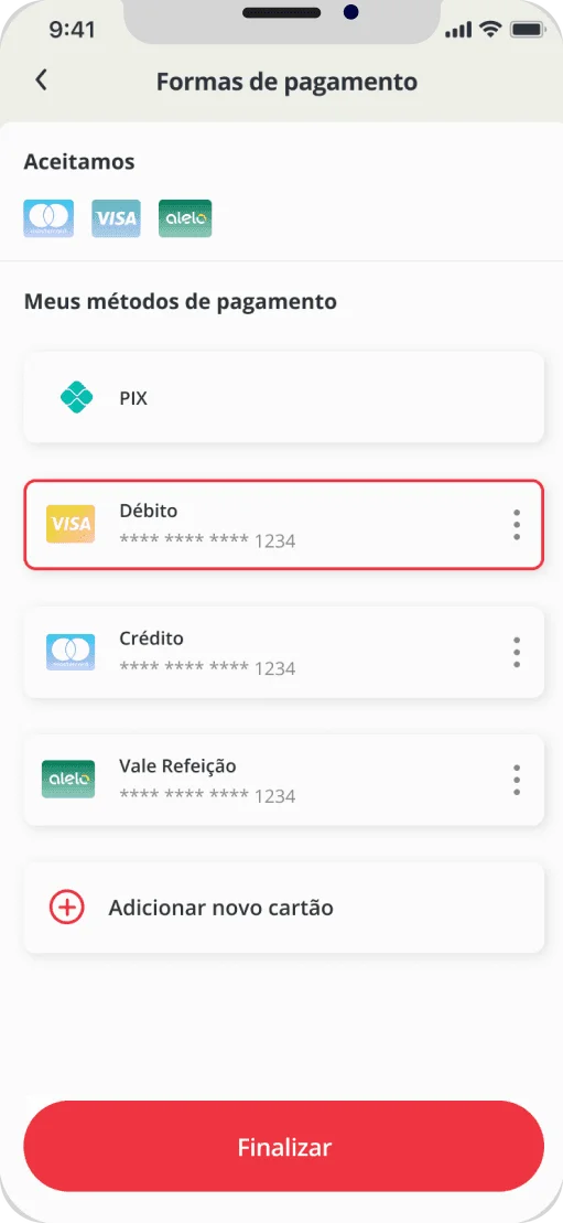
The checkout was designed to feel effortless and trustworthy. Users can review their order, choose delivery options, and select a payment method—all in a clean, step-by-step experience.
Key details like delivery time and total price are clearly displayed, giving users confidence to finalize their purchase without hesitation.